データ解析のための統計モデリング入門 一般化線形モデル(GLM) 読書メモ3
2017年 02月 21日
このブログ記事は『データ解析のための統計モデリング入門』(久保拓弥 著、岩波書店)という、とても分かりやすい統計モデリングの入門書を、さらに分かりやすくするために読書メモをまとめたものです。 今回は第3章、一般化線形モデル(GLM)についてのまとめの三回目です。
この章ではポアソン回帰について説明がされています。
ポアソン回帰によって得られるのは、説明変数と応答変数の分布の関係です。
変数が変化すると別の変数の分布が変化するという、結構複雑な関係が得られるわけです。
分布そのものにも興味はありますが、やはり一番興味があるのは、分布の中でどこが一番確率が高くなるかです。
そこで、本の中で使われているサンプルデータを使ってポアソン回帰をやってみて、得られた分布の中の一番確率が高い場所をプロットしてみました。
コードはRで書きました。
d <- read.csv("data3a.csv")

fit <- glm(y ~ x, data = d, family = poisson)

b1 <- fit$coefficients[1]
b2 <- fit$coefficients[2]

linkFunction <- function(x) {
exp(b1 + b2 * x)
}

fitted <- function(x, y) {
dpois(y, lambda = linkFunction(x))
}

cat("p(y | exp(a + bx)) where p is Poisson distribution\n")
cat("a =", b1, "b =", b2, "\n\n")

y <- 1:20
max <- numeric(length = 20)
for (x in 1:20) {
at <- fitted(x, y)
cat("when x = ", x, ", y = ", which.max(at), " is most probable, probability is ", max(at), "\n")
max[x] <- which.max(at)
}
title <- paste0("p(y|exp(", b1, " + ", b2, "x))")
xl <- "x"
yl <- "the most probable y"
plot(1:20, max, type = "b", main = title, xlab = xl, ylab = yl)
実行すると以下のようなグラフが得られます。
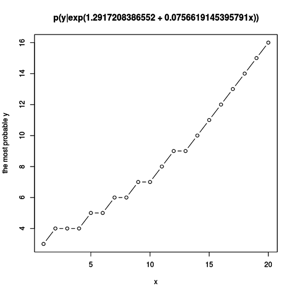
サンプルデータの説明変数 x と応答変数 y には正の相関があるので、 x の増加に従って y の分布は大きな値を取るようになります。
グラフを見ると一番高い確率で得られる y の値が x の増加に従って増えているのが分かります。
正の相関の一面が見られますね。
リンク関数は指数関数なので、もっときれいに指数関数的増加が見られないかとプロットする x の範囲を広げてみました。
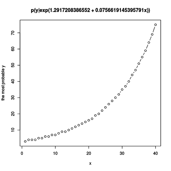
細かい増加は分かりにくくなりましたが、全体的な指数関数的増加がよく分かるようになりました。

#人気の記事
#タグ